FREELANCE WORK
AK-MAK BAKERY PACKAGING
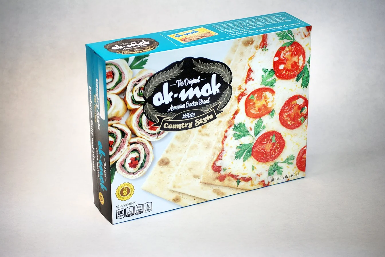
AK-MAK — WHITE COUNTRY STYLE
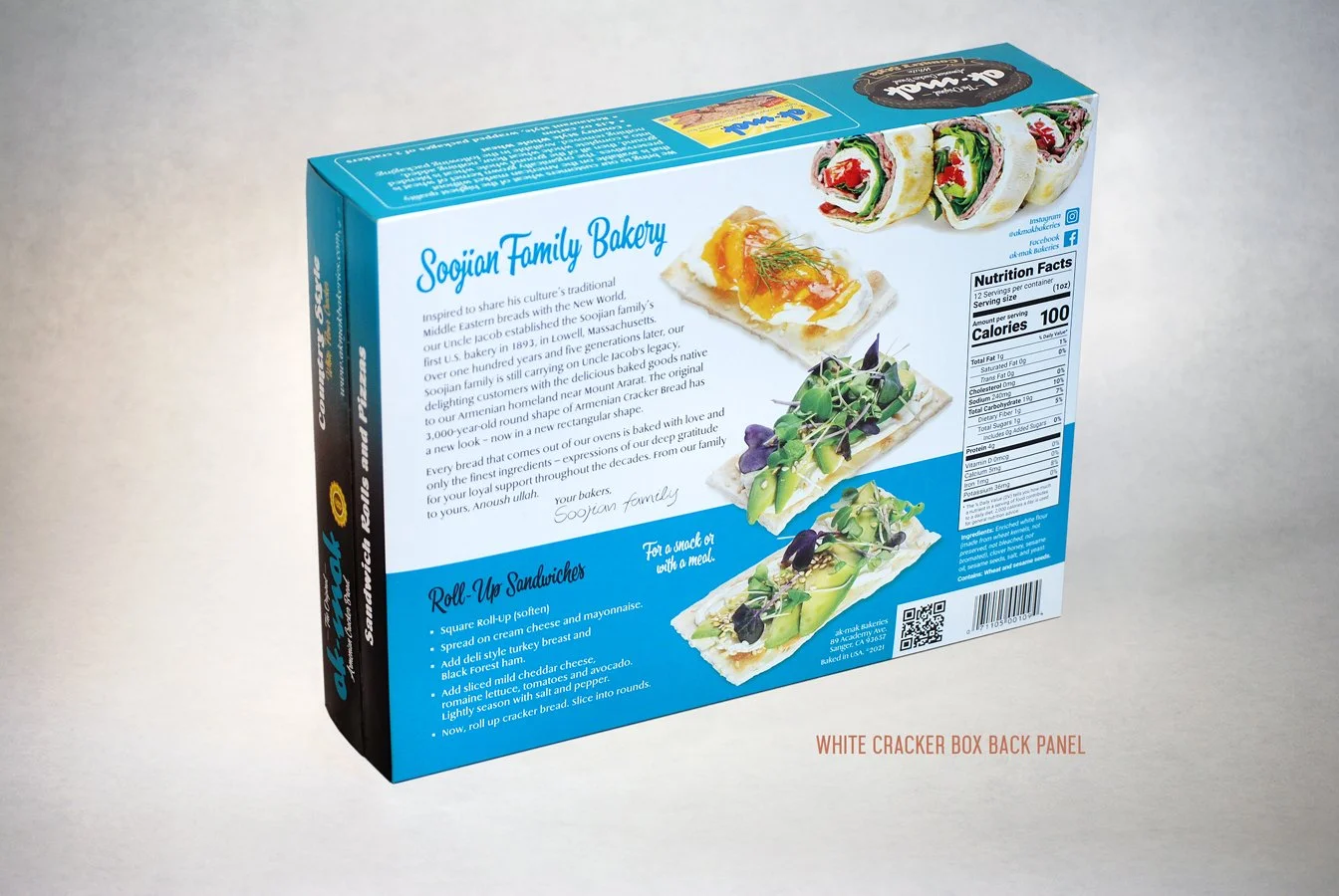
AK-MAK — WHITE COUNTRY STYLE (BACK PANEL)
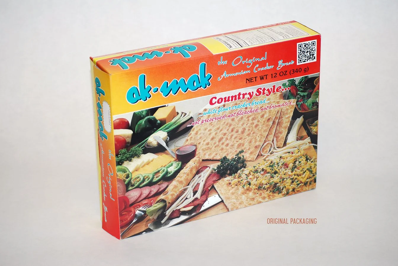
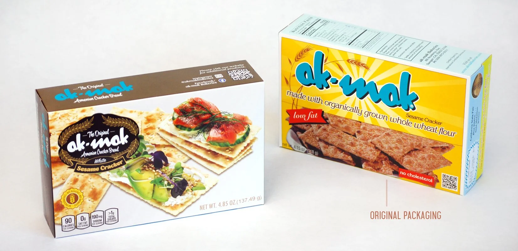
PREVIOUS COMPANY PACKAGING DESIGN
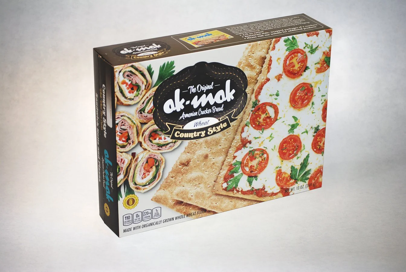
AK-MAK — WHEAT COUNTRY STYLE
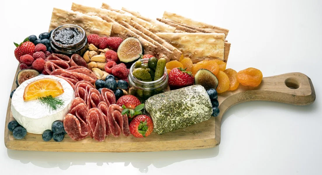
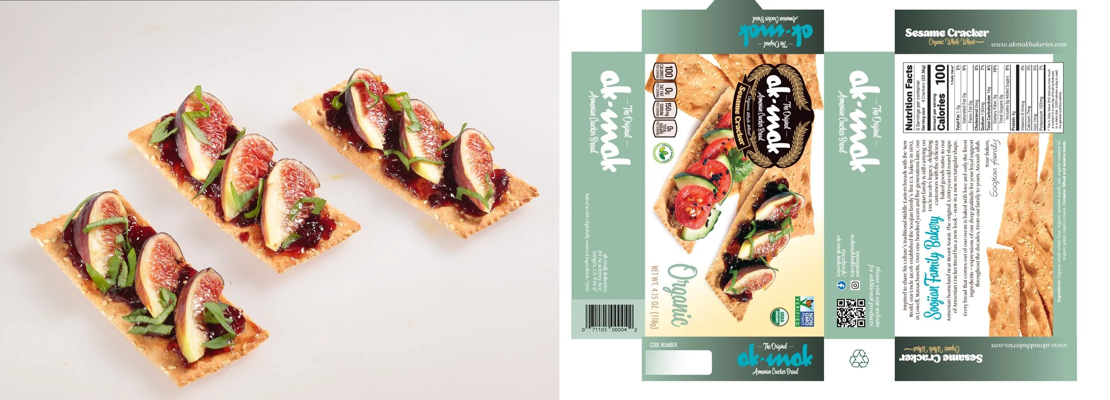
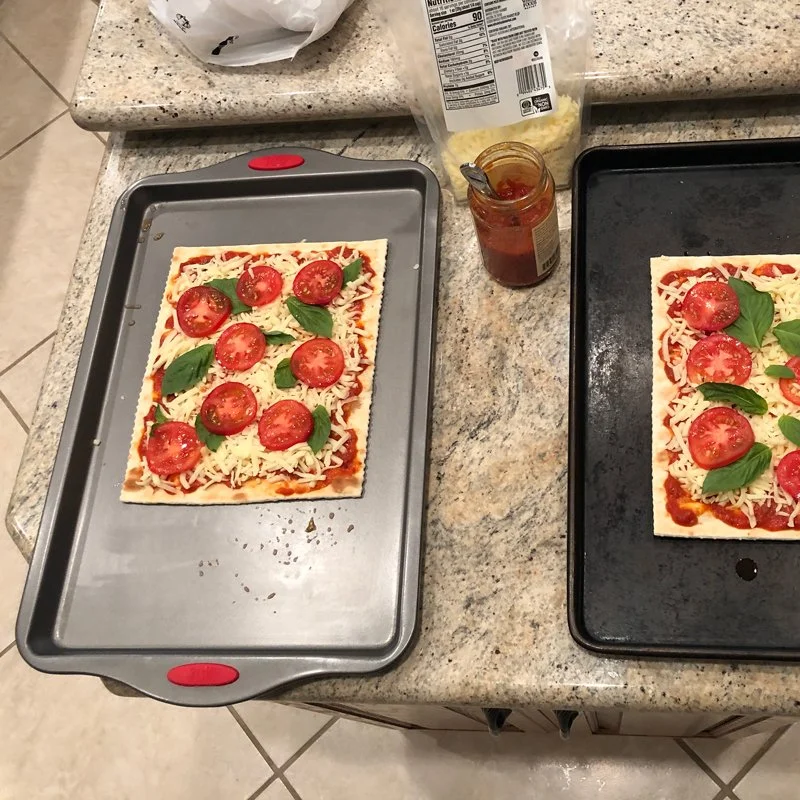
IMAGES PHOTOGRAPHED FOR PACKAGING
DetailS
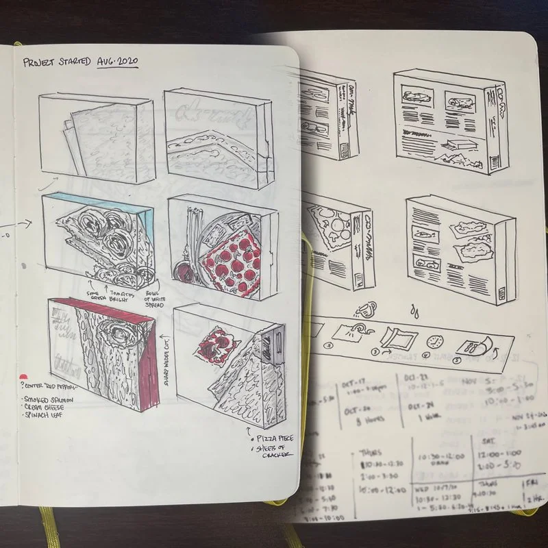
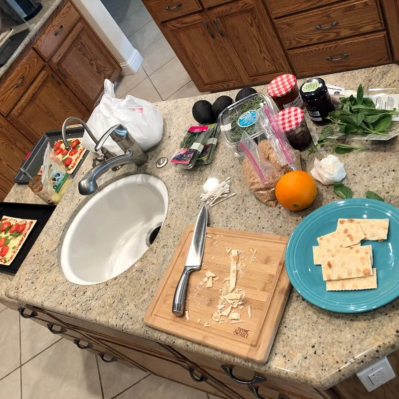
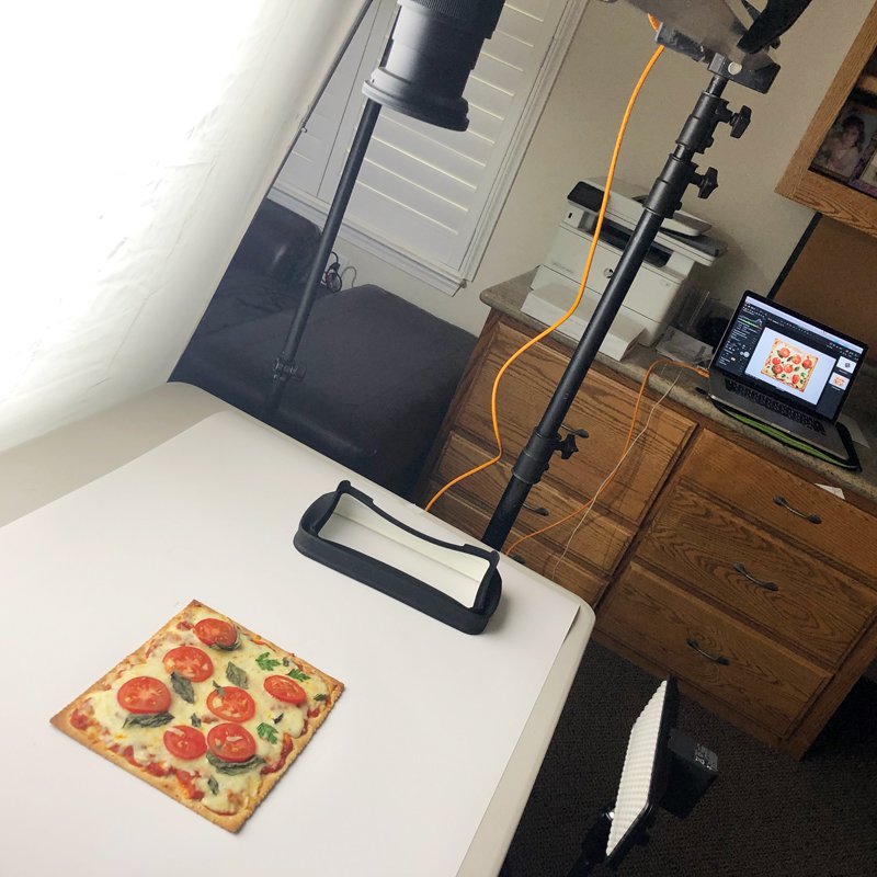
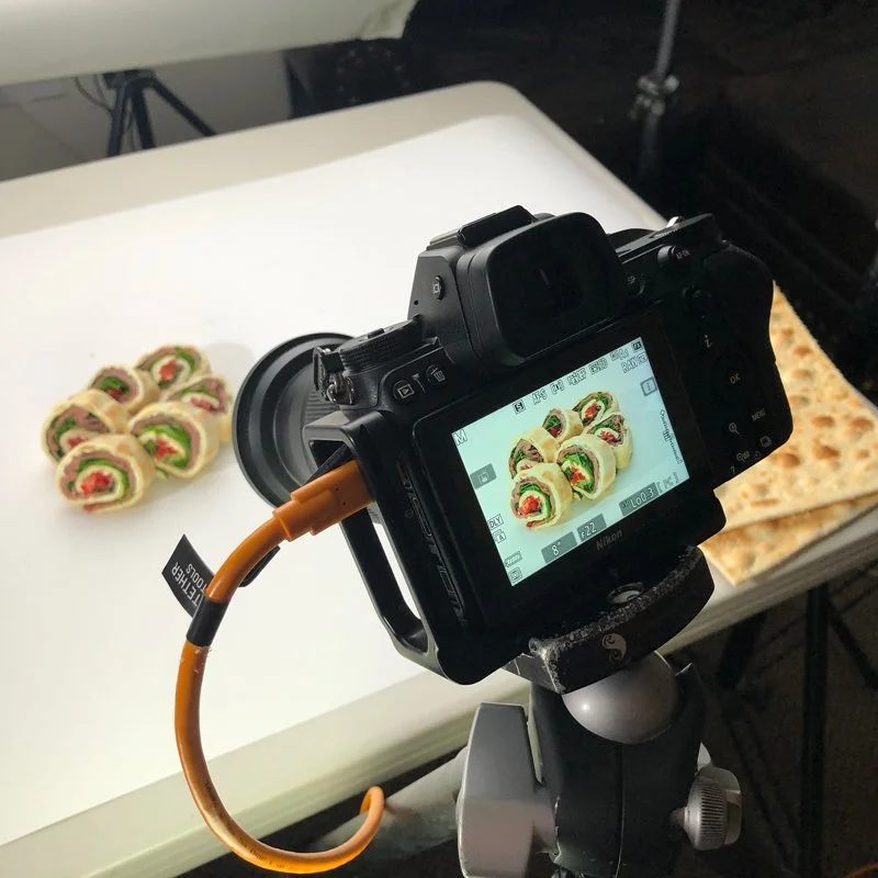
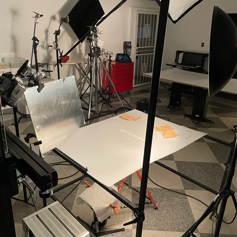
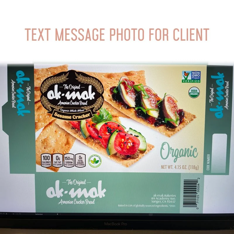
The packaging concept was developed after I met with the client. Once my initial concepts were approved, I began to plan the project stages. I shared my sketches with my photographer and I directed the food preparation with a cook. We used different locations based on the kitchen needs and space. The photographs were then edited, and combined with the package layout.
My work process
Sketch work and create mock-ups
Research, acquire food and supplies
Scout location and schedule photographer
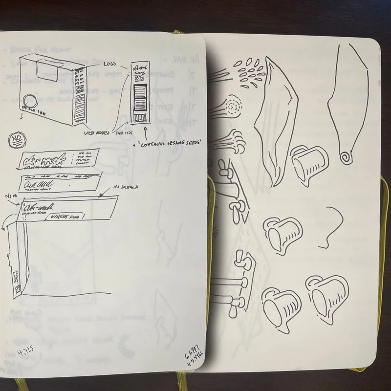
Create illustrations for box instructions
Software used - Illustrator, Photoshop, InDesign, Acrobat
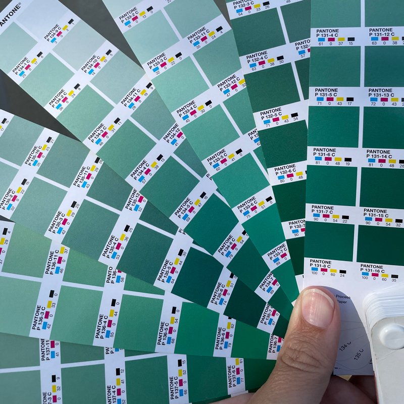
License selected fonts for layout. Use Pantone colors for production.
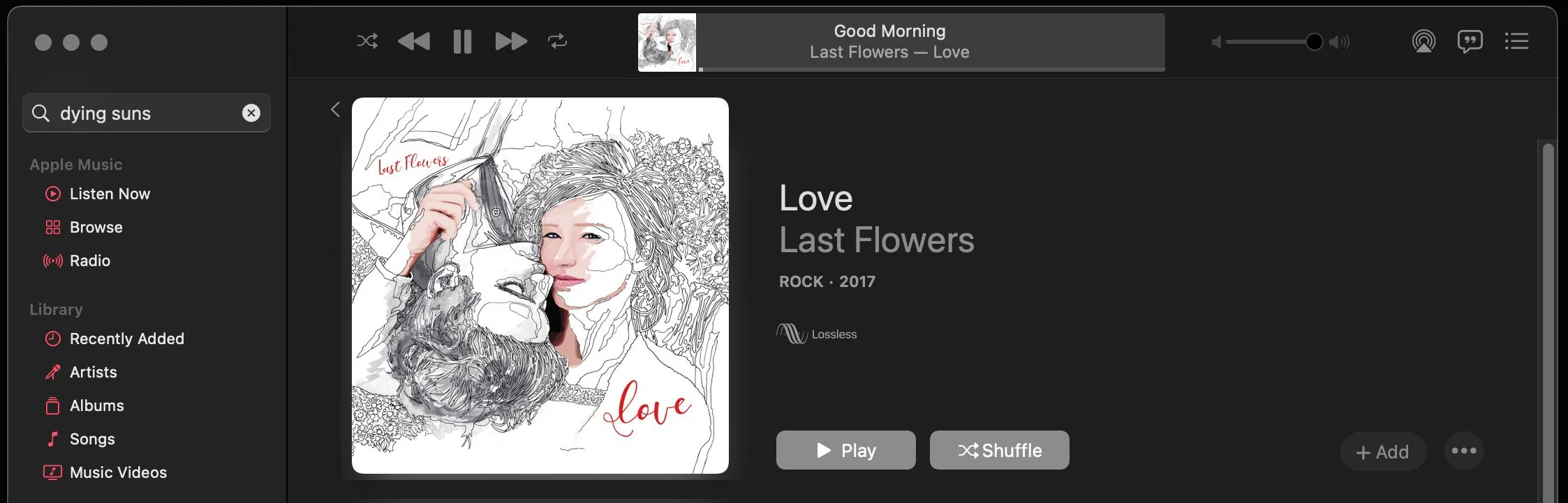
LAST FLOWERS ALBUM
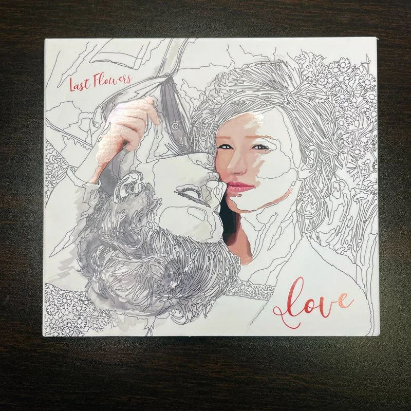
CD CASE. PRINTED WITH SPOT UV ON THE COLOR DETAILS OF THE IMAGE.
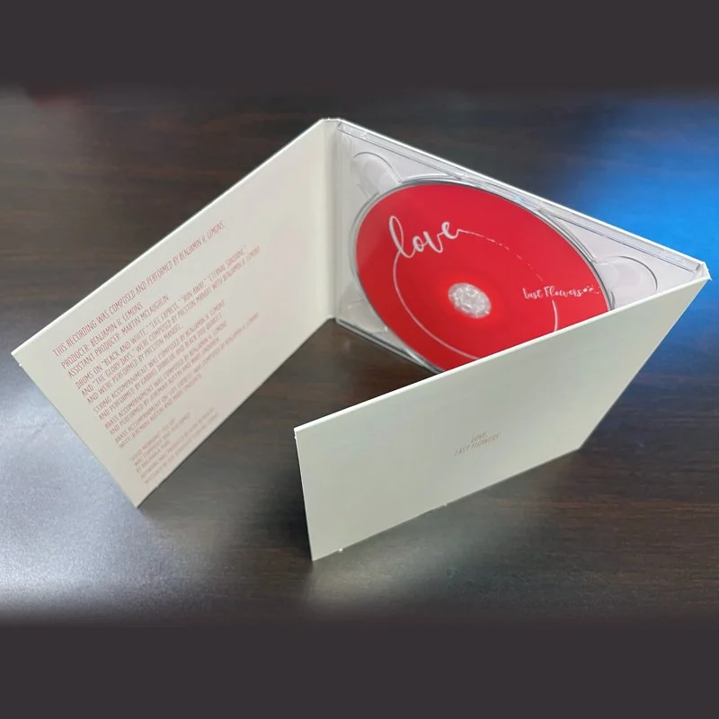
THREE PANEL GATE FOLD WITH DISC IN PLASTIC HOLDER.
Detail 2
The design concept was inspired by a Paint-By-Number image. The idea was to see the image slowly take shape, but instead you are listening to all the songs that reveal a full story. The songs were about love and relationships, and so the image was going to be a couple very closely together in a personal composition. I drew the figures so that they filled the space equally and that the image could be rotated 180 degrees and it would be balanced but from the other person (the guys) in the pictures right-side-up perspective.
THE DYING SUNS ALBUM
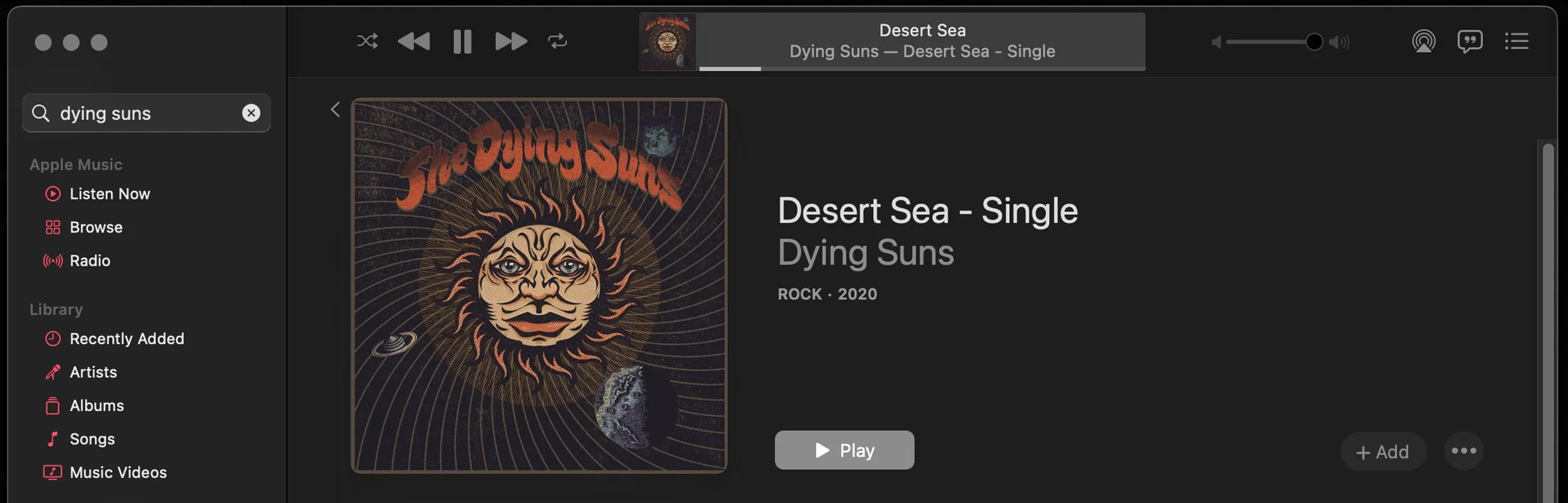
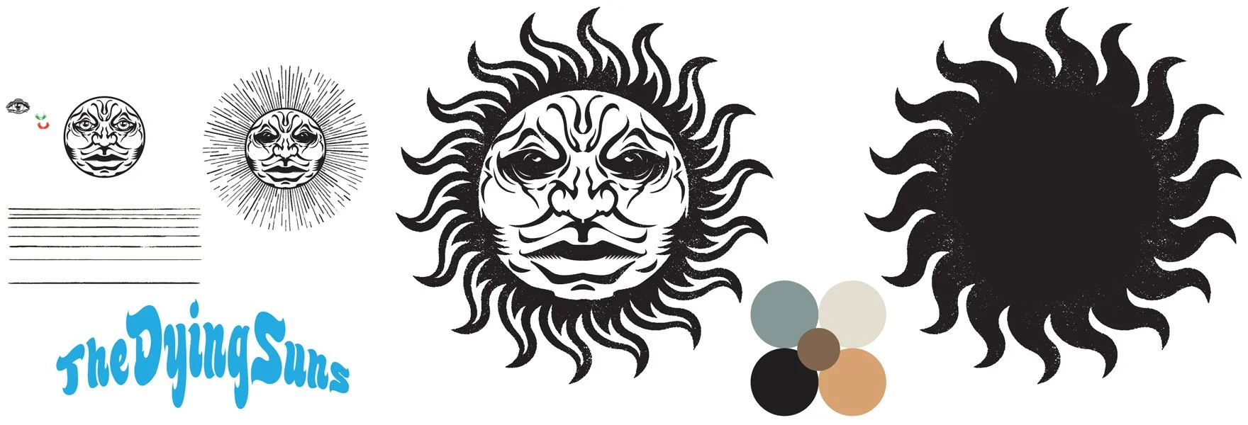
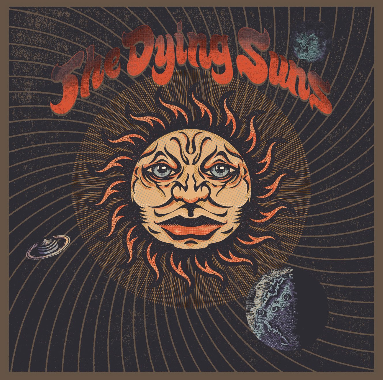
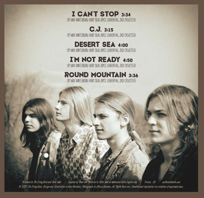
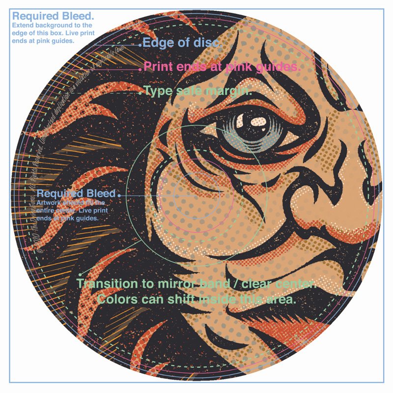
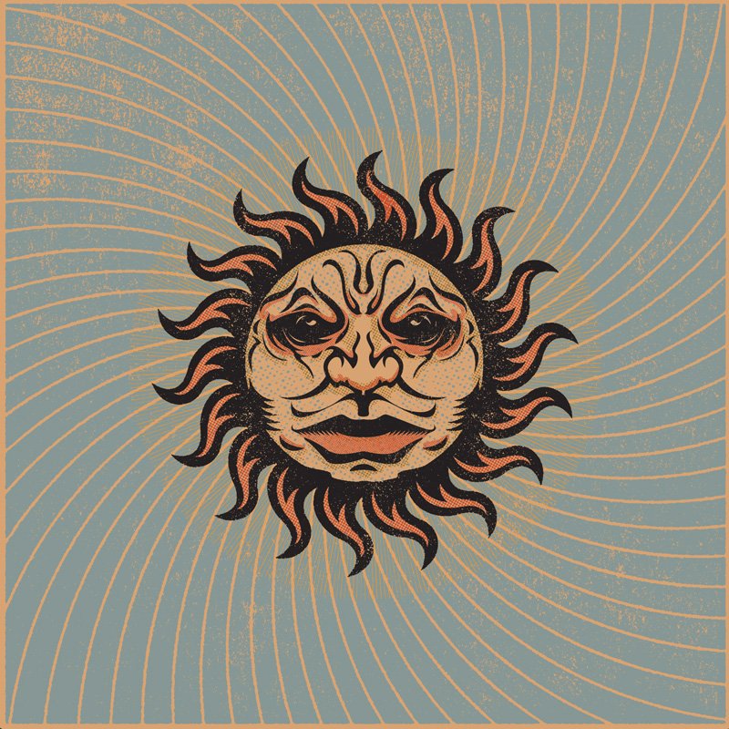
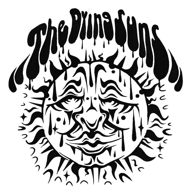
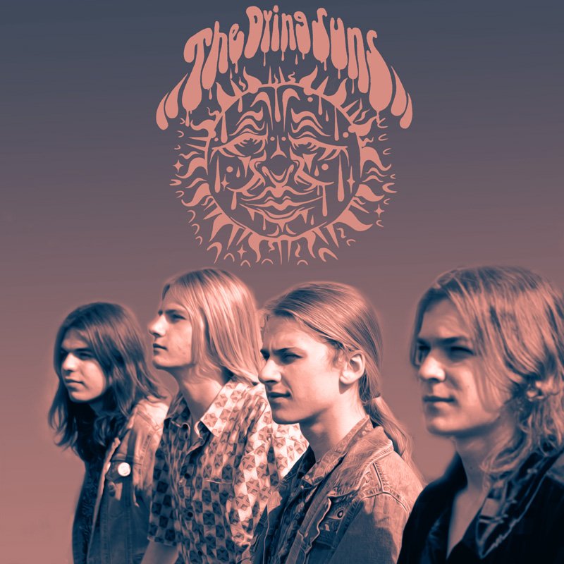
VECTOR TEXT LOGO WAS CREATED FOR THE BAND. THEIR DRIP DESIGN MADE IT HARD TO READ THE TEXT IN THE DRIP STYLE. AFTER I CREATED THE SUN IN ILLUSTRATOR I USED VECTOR EFFECTS TO DISTRESS THE LOGO. I ALSO CREATED MY OWN PEN LINE BRUSHES TO MAKE THE SUN RAYS. COLORS WERE SELECTED TO APPEAR VINTAGE.
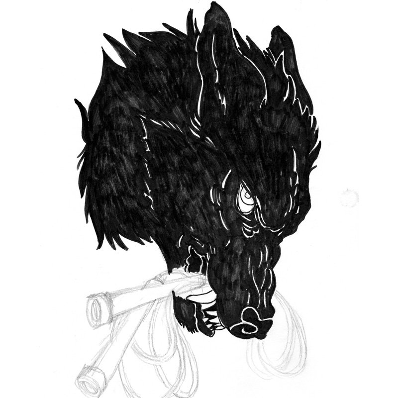
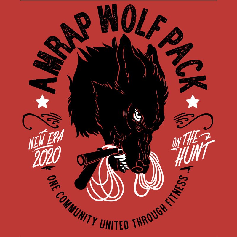
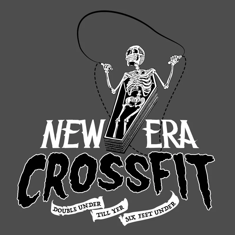
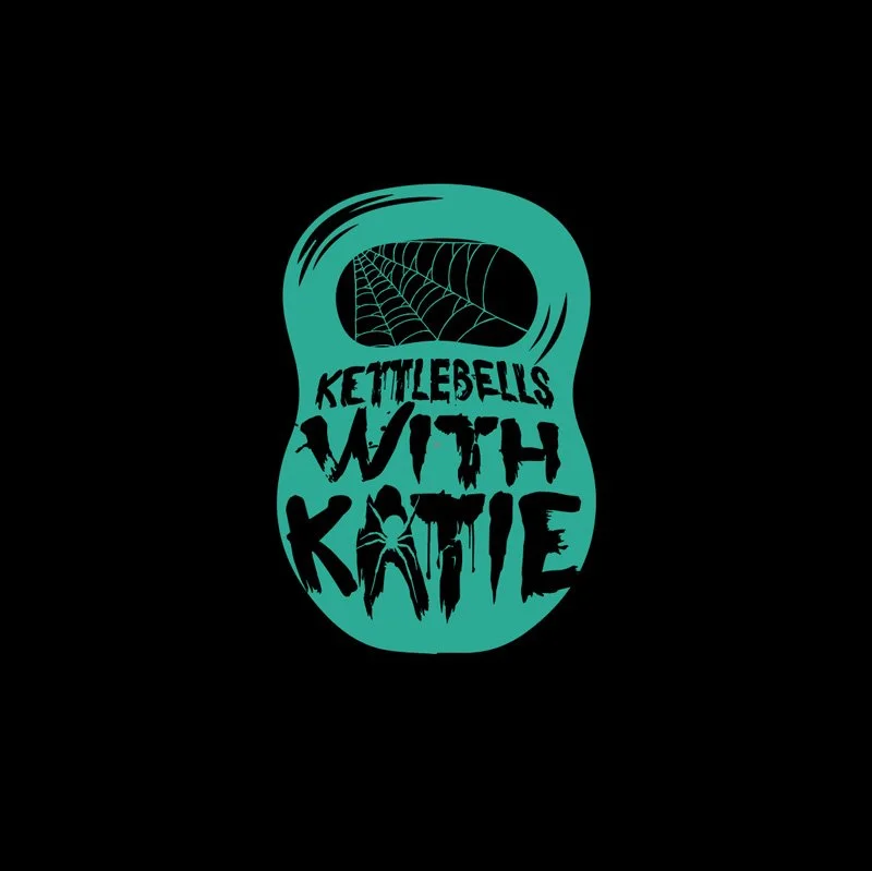
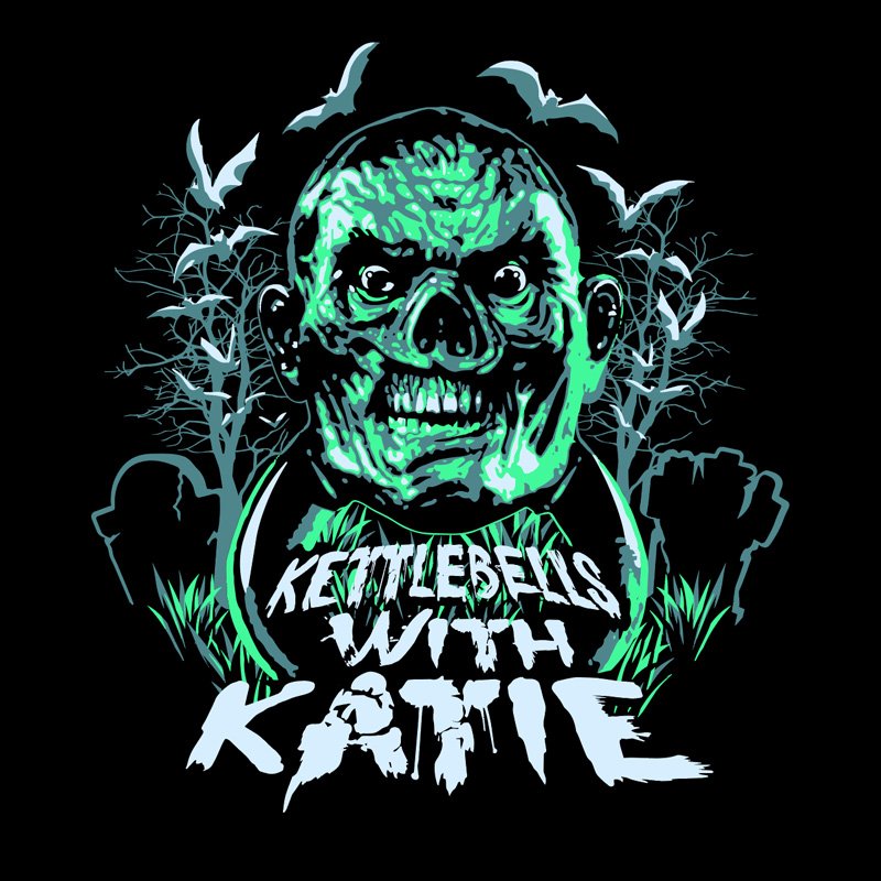
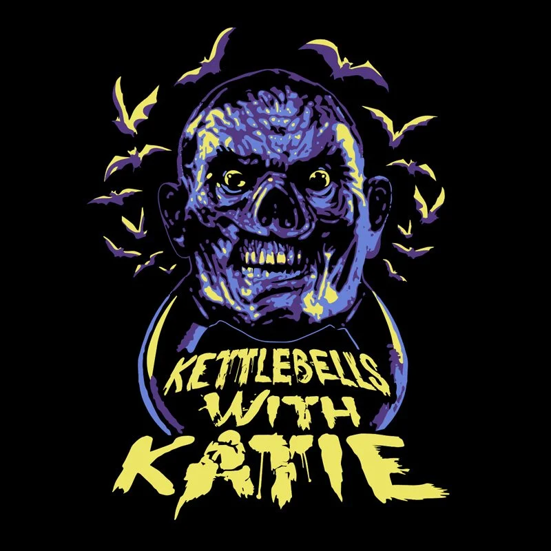
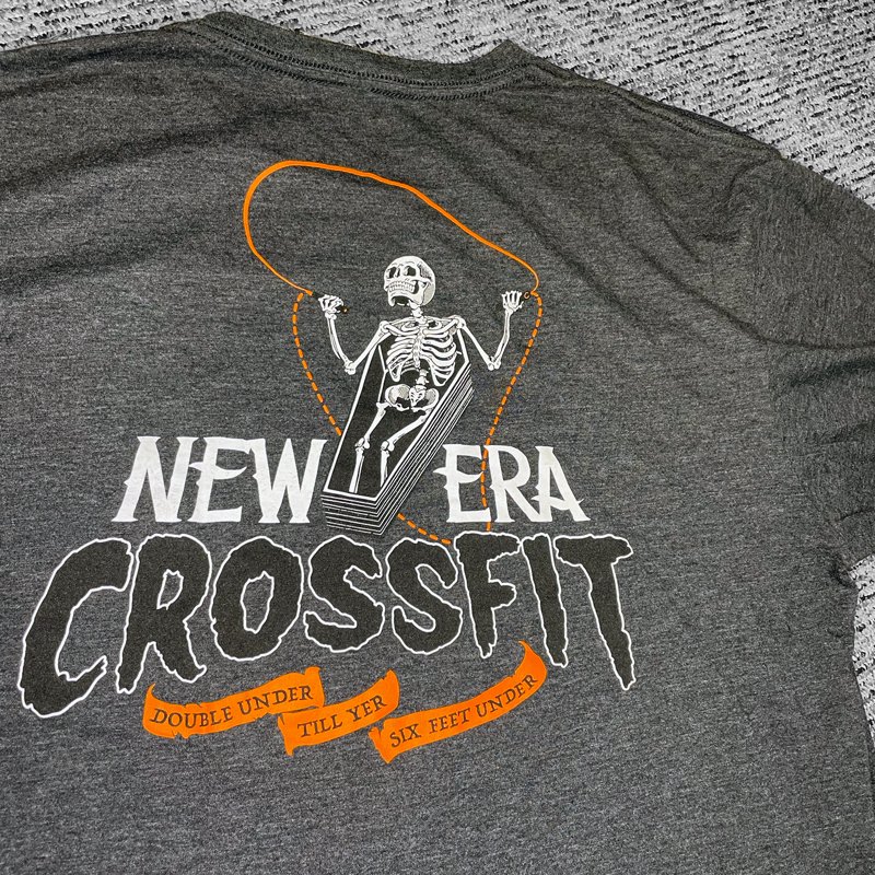
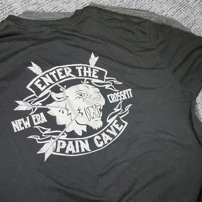
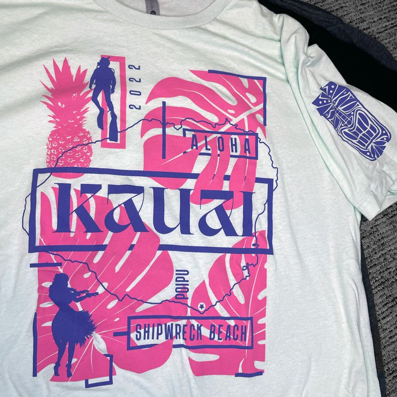
CROSSFIT APPAREL
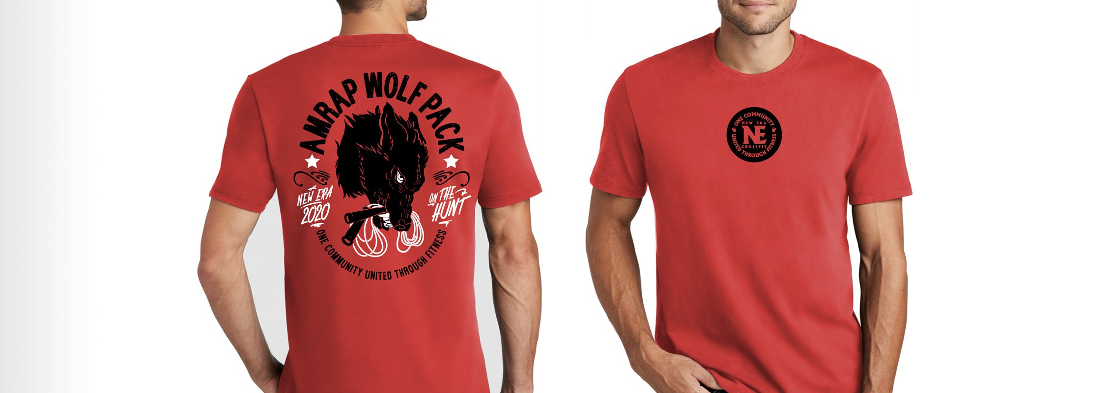
SHIRT DESIGNS FOR THE GYM I ATTEND. THEY CREATE THEMED EVENTS AND HAVE MATCHING APPAREL.